
From Friction to Flow: Revamping the SL Railways Seat Reservation App
B2C
Utility App
Usability Improvement
Accessibility Improvement
Expected Impact
Reduce booking errors and failed searches
Improve completion rates of seat reservations
Increase user confidence during payment
Introduction
The Sri Lanka Railways seat reservation mobile application plays a critical role in enabling passengers to plan journeys and reserve seats digitally.
However, the current user experience presents several usabilityand accessibility challenges that negatively impact task completion and user confidence.
This case study outlines the revamp process undertaken to improve the overall usability, clarity, and accessibility of the seat reservation flow within the mobile app.
Discovery & Usability Evaluation
The revamp process began with a self-conducted usability evaluation based on first-hand experience usingthe existing seat reservation mobile application.
By completing the end-to-end booking flow as arepresentative user, several usability and accessibility issues were identified.
This experience-based assessment functioned as a heuristic evaluation, focusing on clarity of labels, discoverability of actions,feedback during interactions, and error prevention.
Method:
Self-led usability testing using the live mobile app.
Completion of core tasks: searching trains, selecting dates, choosing passengers, and attempting payment.
Identification of friction points, confusing interactions, and accessibility gaps.
This evaluation confirmed the need for a revamp and informed all subsequent design decisions.
Key Usability & Accessibility Issues Identified
Search & Input Issues
- Ambiguous labels such as “Select Start” and “Select End” caused confusion for first-time users.
- The return date option was not discoverable and lacked clear interaction feedback.
- Passenger count selection used unclear terminology (e.g., “1X, 2X”), increasing cognitive load.
- The search action was enabled even when required fields were incomplete, leading to frequent errors.
Flow & Feedback Issues
- Lack of step indicators made it unclear where users were in the booking process.
- Generic error messages (e.g., “Error occurred”) provided no guidance for recovery.
- No clear system feedback during loading or payment processing.
Accessibility Issues
- Low contrast text and small tap targets reduced readability and usability for users with visual or motor impairments.
- Form inputs were not optimized for mobile keyboards or assistive technologies.
Problem Statement.
The existing seat reservation mobile app presents usability and accessibility barriers that lead to user confusion, increased booking errors, and drop-offs during critical steps such as search and payment.
These issues reduce user trust in the platform and limit the effectiveness of digital seat reservations.
Revamp Goals & Objectives
- Improve clarity of labels, inputs, and actions.
- Reduce cognitive load during the reservation process.
- Prevent user errors through better validation and feedback.
- Enhance accessibility and inclusivity.
- Create a smoother, more confident end-to-end booking experience.
Revamped Flow
Search Train → Select Train → Enter Passenger Details → Review Booking → Make the payment → Confirmation
Solution and the Key Improvements
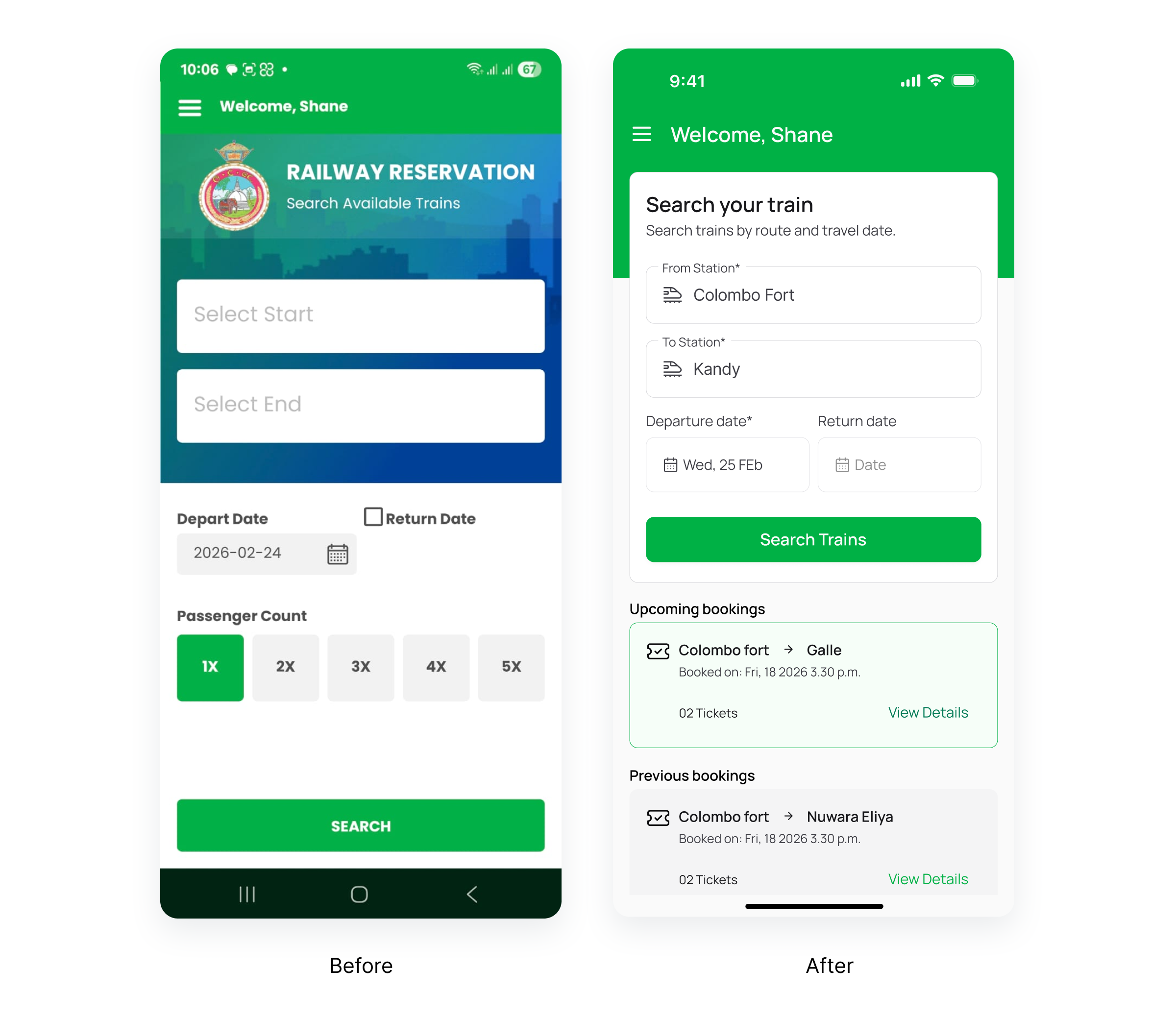
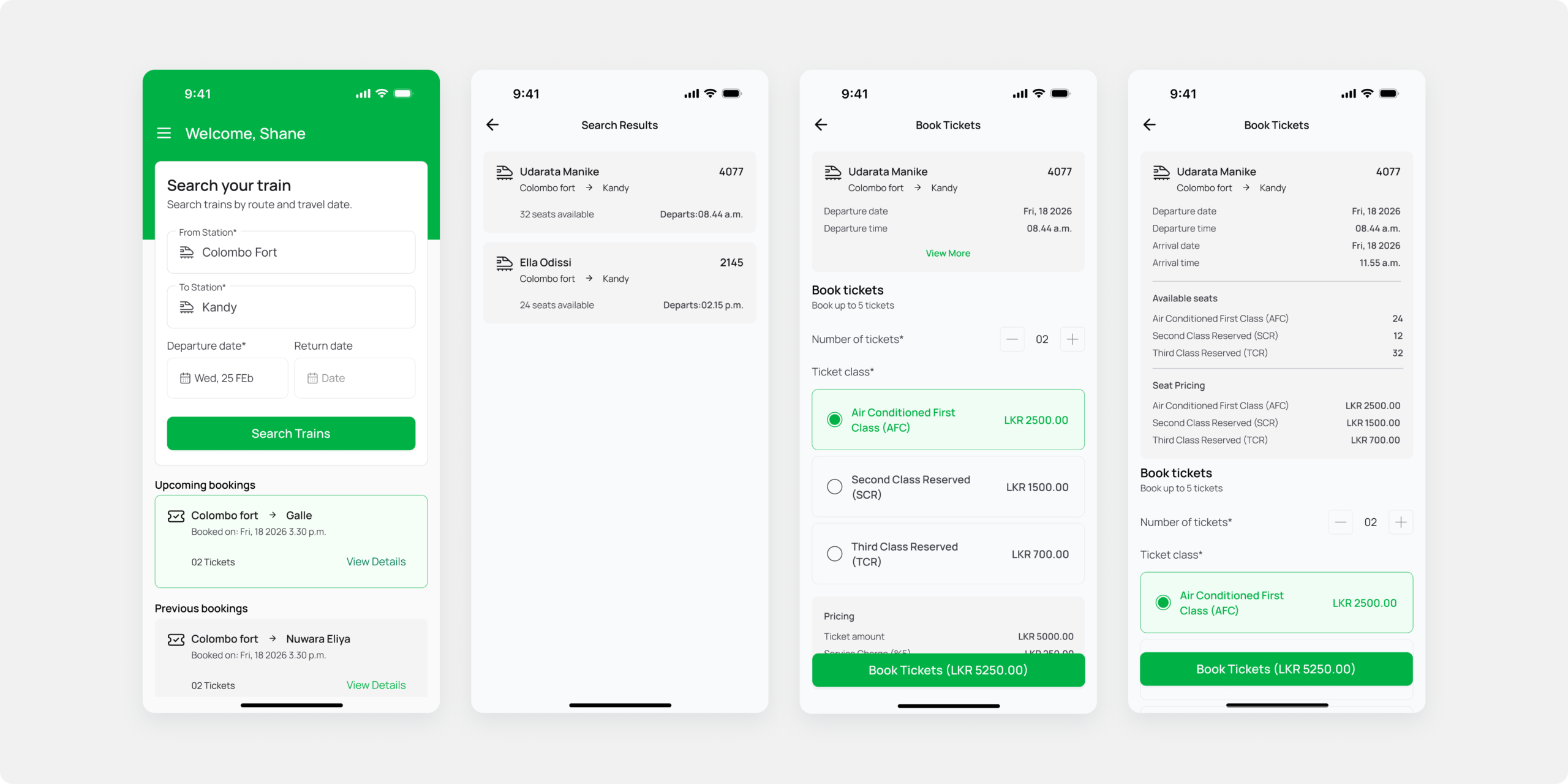
Search Screen
- Clear labels: “From Station” and “To Station”
- Human readable date format
- Passenger count selector with explicit labels
- Disabled search button until mandatory fields are completed
- Improved the visual hierarchy by removing unnecessary branding elements and prioritize core user tasks.
Upcoming and Previous booking sections
- Added “Upcoming” and “Previous Bookings” sections to display booking history, improving transparency and building user trust.
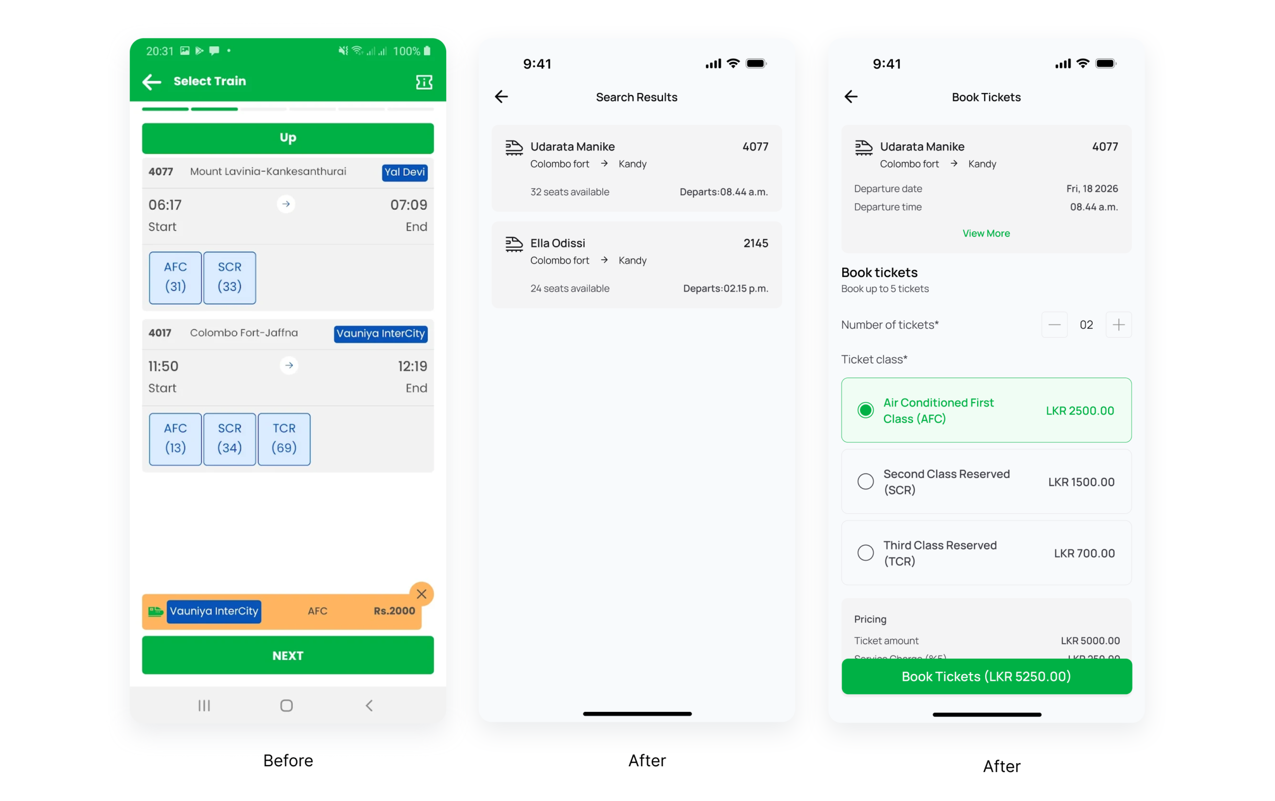
Search results and Ticket booking screen
- Clear and structured search results page to reduce confusion when comparing and selecting trains
- Transparent pricing breakdown on the booking page to improve cost clarity and user confidence
- Full ticket class names displayed to remove ambiguity around seat classes and support informed decisions
- Stepper control for ticket quantity selection to make adjusting passenger count more intuitive
- Clearly labeled ticket class selection options to reduce user errors and simplify the booking process
- Explicit primary action: “Book Tickets”
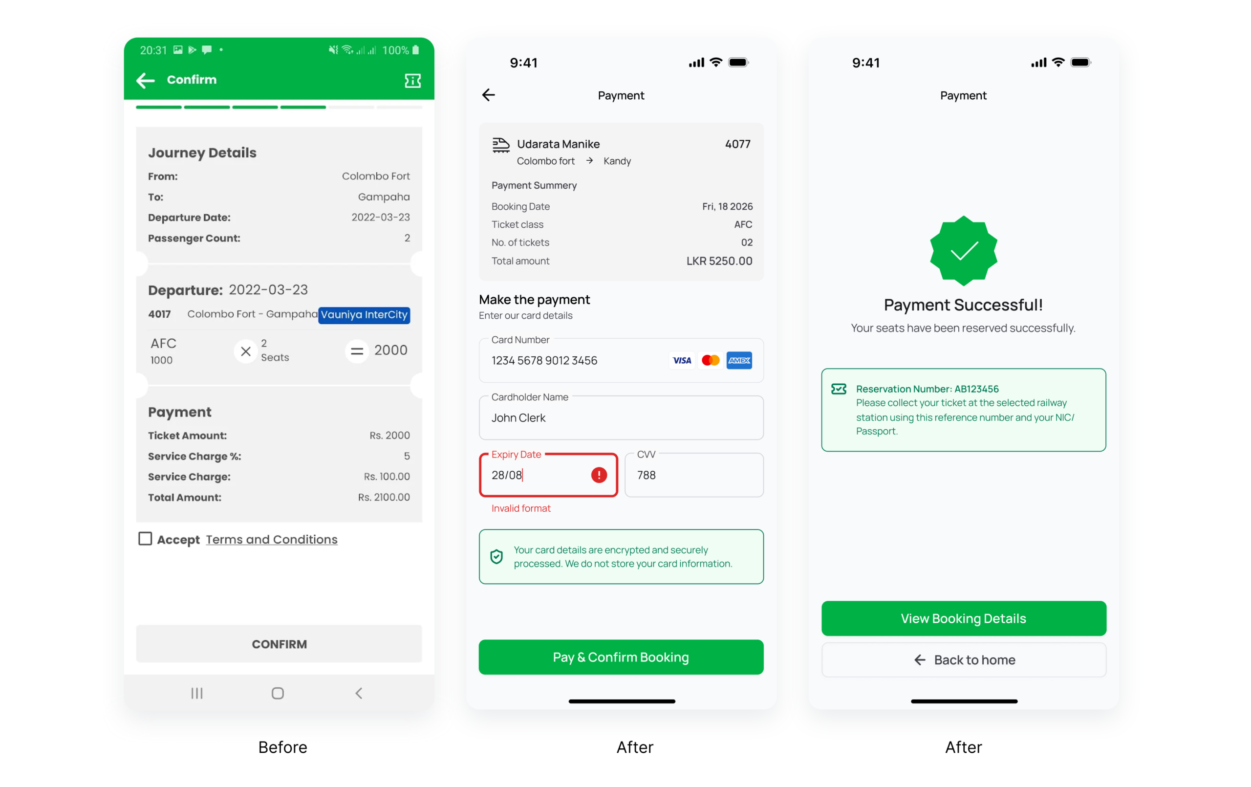
Payment screen
- Simple and guided card input form
- Inline validation for card number, expiry date, and CVV
- Clear security assurance: encrypted payment processing
Payment success screen
- Clear success state to immediately confirm that the payment and booking were completed successfully
- Prominent reservation number display to help users easily reference and retrieve their booking
- Clear instructions on ticket collection to guide users on the next steps after payment
- Direct call-to-action (“View Booking Details”) to allow users to quickly access and review their booking information
Accessibility Enhancements
- Improved color contrast for readability
- Minimum touch target sizes for buttons
- Support for screen readers and assistive technologies
- Localization support for Sinhala and Tamil
- Clear focus states and input guidance
- Friendly, non-technical microcopy
Expected Impact
The proposed revamp is expected to:
- Reduce booking errors and failed searches
- Improve completion rates of seat reservations
- Increase user confidence during payment
- Improve accessibility for diverse user groups
- Provide a more modern and user-centered booking experience
Thanks for reading.