
Creating a User-Focused Solution for Complex Facility Booking Needs
B2B
SaaS Platform
Usability Improvement
Impact
Support tickets reduced by nearly 70% due to clearer feedback and fewer booking errors
Booking efficiency increased by 50%, allowing officers to complete tasks faster
Introduction and Project Context
As a UX designer, I was tasked with revamping the facility management section of a SaaS platform used by condominium management officers. The goal was to address both long-standing usability issues and unmet functional needs that were negatively affecting platform adoption and user satisfaction.
Partnering with the business development team, we approached the redesign holistically, centering the process on understanding real user behaviors and pain points.
My Role
Solo UX Designer
Team
1 UX Designer
2 Developers
1 QA Engineer
Timeline
5 Weeks
Understanding Users’ Needs
We started with user research to understand what the current platform was missing and what management officers truly needed. Through a combination of open-ended user interviews and hands-on usability testing, we gained in-depth insights directly from those who manage condominium facilities on a daily basis.
From user interviews, several key challenges emerged:
The platform failed to address the most common and urgent pain points of management officers.
Facility booking was inconsistent. Some facilities required fixed rates while others needed hourly rates, but the system treated all bookings the same.
- Some facilities are open all day, while others are available only during specific time slots. The existing platform did not support managing these varied schedules, which caused frustration and booking errors.
- Several facilities were complex, needing sub-facility booking features. For instance, restaurant spaces needed the ability to book individual tables, a feature the current system lacked.
Many users highlighted the need for a maintenance-notice feature when a facility was temporarily unavailable.
The booking calendar left users confused. Information was unclear, and the process to book or view availability felt frustrating.
Users asked for a way to send messages if a booking was declined, so they could resolve issues without leaving the platform.
Usability testing with current users highlighted further issues with the product experience:
A lack of system visibility meant users often received no confirmation or error messages, which left them uncertain about whether their actions were successful.
Navigation was confusing, leading to task failures and repeated steps.
Multiple colored buttons and inconsistent, unfamiliar icons created cognitive overload.
Buttons had low color contrast, making calls-to-action unclear and reducing accessibility.
The overall clarity and usability of the CTAs (call-to-actions) were lacking, making it hard to complete even basic tasks.
Addressing Core Challenges
The key problems became clear from our research. Facility management officers required a booking system that could flexibly adapt to different facility types and their unique needs.
Lack of clarity in essential features such as notifications, calendar interactions, and messaging created frustration and added unnecessary effort for users. Visual and interaction inconsistencies worsened the experience, causing lower trust and inefficiency.
The core problem was that management officers needed a more flexible, transparent, and easy-to-use system to handle bookings, maintenance, and communication. The current platform did not support real-world variations or provide clear feedback and guidance.
Exploring Solutions
With user and business priorities synthesized, I led a series of ideation sessions. Drawing from user insights and leveraging the expertise of our multidisciplinary team, we developed concepts designed to resolve each pain point.
Our primary solutions included:
Designing a modular booking system supporting both fixed and hourly rates, as well as the ability to book sub-facilities.
Introducing contextual maintenance notices that instantly informed users about facility availability.
Adding a direct messaging feature for declined bookings, allowing issues to be addressed seamlessly.
Redesigning the booking calendar to be more visual, interactive, and informative, reducing confusion at every stage.
Establishing a consistent, accessible color palette and icon system across all facility management features for improved clarity and usability.
Bringing Ideas to Life
Initial concepts were transformed into interactive wireframes and clickable prototypes.
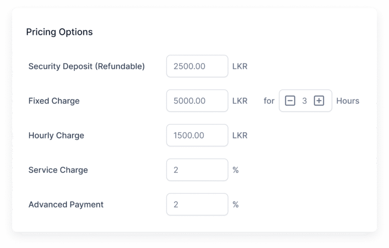
Flexible Pricing Options
We added input fields for both fixed charges and hourly rates with hour limits. This allows the system to handle different pricing models, making bookings clear and tailored to facility requirements.
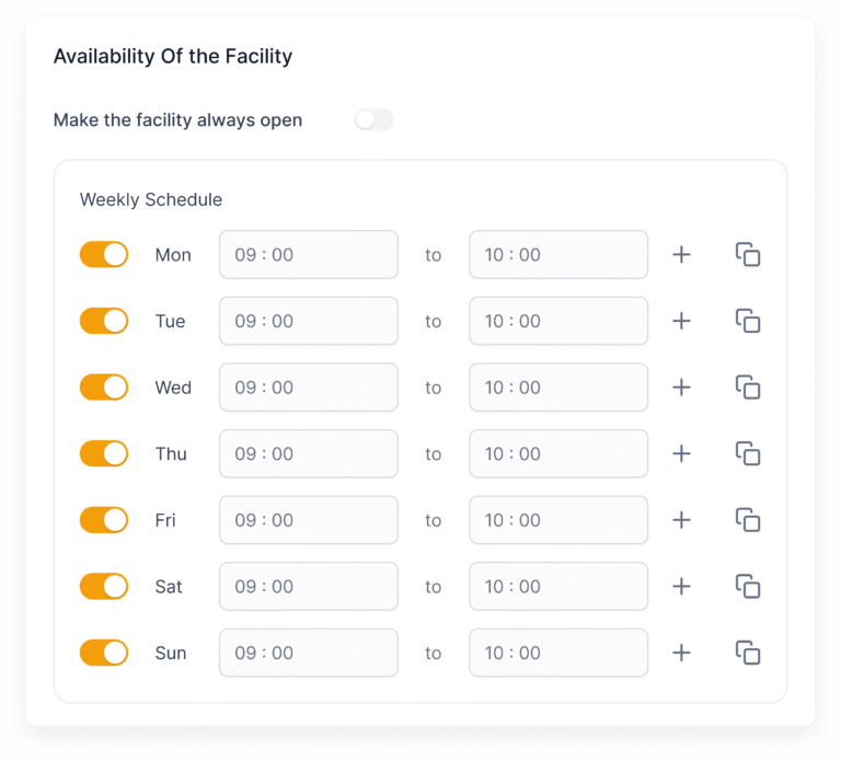
Configurable Facility Hours
A toggle button lets users mark facilities as always open. If switched off, users can define specific time slots for facility availability. This flexibility prevents booking errors and matches real operational hours.
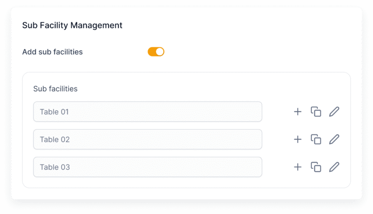
Sub-Facility Management
We introduced a toggle to enable sub-facilities and allow users to list them. This supports complex facilities like restaurants needing table bookings and improves booking accuracy and user control.
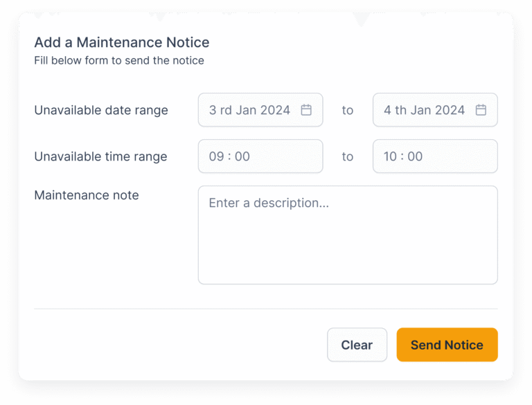
Maintenance Notice Feature
We designed a feature within each facility to send maintenance notices directly to residents. These messages appear clearly in the resident app, improving communication and reducing surprise disruptions.
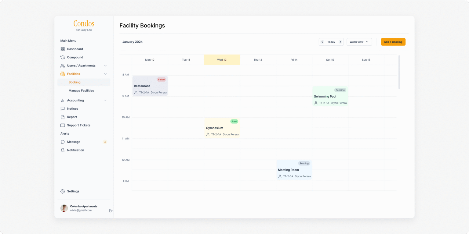
Improved Booking Calendar
The booking calendar was redesigned to show the most relevant details prominently. Clicking on a booking slot reveals a popup with additional information, making it easier for users to understand availability and booking details.
Declined Booking Messaging
We added a text field to enter a reason when declining a booking, along with a confirmation button. This feature allows users to communicate decline reasons without leaving the platform, enhancing transparency and user control.
Visual Facility Listing
We replaced the facility listing table with a card view that prioritizes essential details at a glance. This visual approach helps users quickly find key information, increasing efficiency and satisfaction.
Solving Usability Issues
Usability issues impacted the user experience by creating uncertainty and confusion, reducing efficiency and increasing cognitive load. Without clear feedback, users could not confidently complete tasks. Inconsistent visual cues like color and icons made navigation more difficult and the system less accessible.
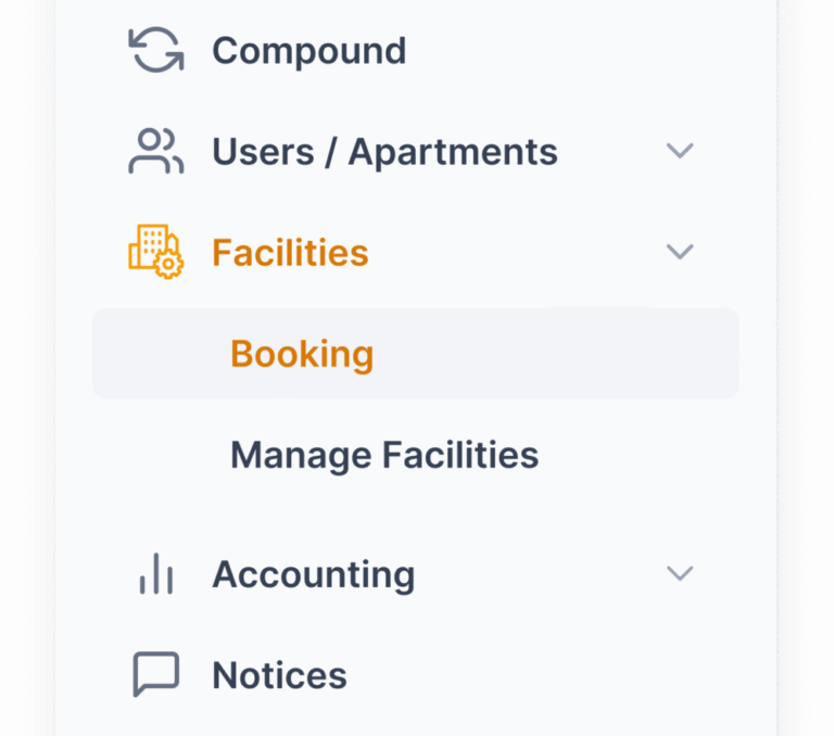
Solving Navigation Confusion
We simplified navigation by identifying two core functions: booking creation and facility management. We separated the facility section into clear parts focused on bookings and managing facilities. This helped users quickly find what they needed without confusion.
Improved System Feedback
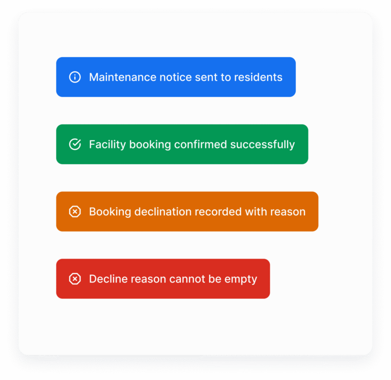
We introduced toast messages that provide immediate, unobtrusive feedback on user actions. Clear success and error notifications enhance system visibility, confirming task completion and guiding users through necessary corrections, which significantly reduces uncertainty.
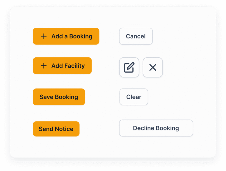
Consitent and Clear CTAs
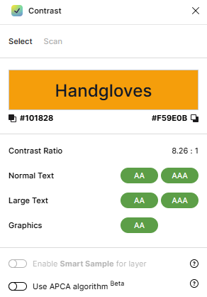
We developed and implemented a design system that aligned button colors with brand guidelines, establishing clear primary and secondary call-to-actions with distinct text labels. We rigorously checked color contrast to meet accessibility standards.
This consistent design system improved button visibility, reduced cognitive overload, and made user actions more intuitive and accessible across the platform.
Validating the Solution
The new facility management flow was validated using various UX testing methods that ensured thorough and realistic insights.
Moderated in-person usability testing allowed us to observe how existing users interact with the system in a controlled setting. This provided rich qualitative data and immediate feedback.
A/B testing enabled comparison between the redesigned and previous booking calendar layouts, revealing improvements in task success and user satisfaction.
Remote unmoderated testing expanded our reach, capturing natural user behavior in real-world environments and providing quantitative performance metrics.
Continuous iteration based on this feedback helped refine visual elements like button styles, iconography, and messaging workflows.
The result was higher user confidence, trust, and overall satisfaction with the facility management process.
Outcome and Impact
The redesigned facility management section fundamentally transformed the user experience for condominium management officers. By addressing real-world booking complexities, introducing essential messaging and notification features, and removing friction from navigation and task completion, productivity and satisfaction both increased substantially.
Support tickets reduced by nearly 70% due to clearer feedback and fewer booking errors
Booking efficiency increased by 50%, allowing officers to complete tasks faster
These impacts demonstrate a significant enhancement in usability and operational effectiveness.