A Token-Driven Component Library to Reduce Handoff Friction and Ship Faster
Design System
Design Tokens
Documentation
Impact
Screens assembled from reusable components instead of one-off builds
Screen build time reduced by ~25–35% across key flows
The Challenge
Facing the Mess and Setting a Direction
In this project I was the lead product designer and I was tasked to lead a revamping and adding features to an existing EV charging platform.
We inherited an externally built app that worked but showed inconsistent patterns, uneven accessibility, and duplicated components. Handoffs created confusion, engineers reimplemented UI repeatedly, and delivery slowed.
There was no single source of truth to guide decisions. We needed a coherent foundation, faster feedback loops, and clear standards to restore speed and quality.
Partnering with the business development team, we approached the redesign holistically, centering the process on understanding real user behaviors and pain points.
My Role
Lead UX Designer
Team
1 UX Designer 1 Developers 1 QA Engineer
Timeline
3 Weeks
The Goals
Setting a Clear North Star
We set out to build a modular component library for mobile, supported by clear documentation and a design kit that mirrors the code. The aim was to ship faster, cut handoff friction, and bring consistency to every screen.
We anchored everything in tokens so themes and accessibility needs could scale without rework.
Build modular Flutter component library.
Write clear docs that helps developers.
Create matching Figma UIKit.
Constraints
Working Within Tight Limits
Time and team size shaped every decision. We had three weeks, one developer, one QA, and I led the system and all design work.
With no dedicated squad or extra capacity, we trimmed nice to haves, focused on the highest impact components, and built only what we could test and document properly within the window.
• Existing app had to keep shipping without disruption • Scope limited to the most critical reusable mobile components • Accessibility and contrast requirements to meet from day one • Documentation and QA had to run in parallel with build • Limited time for motion, edge cases, and advanced components in the first release
Foundations
Laying the Ground with Tokens
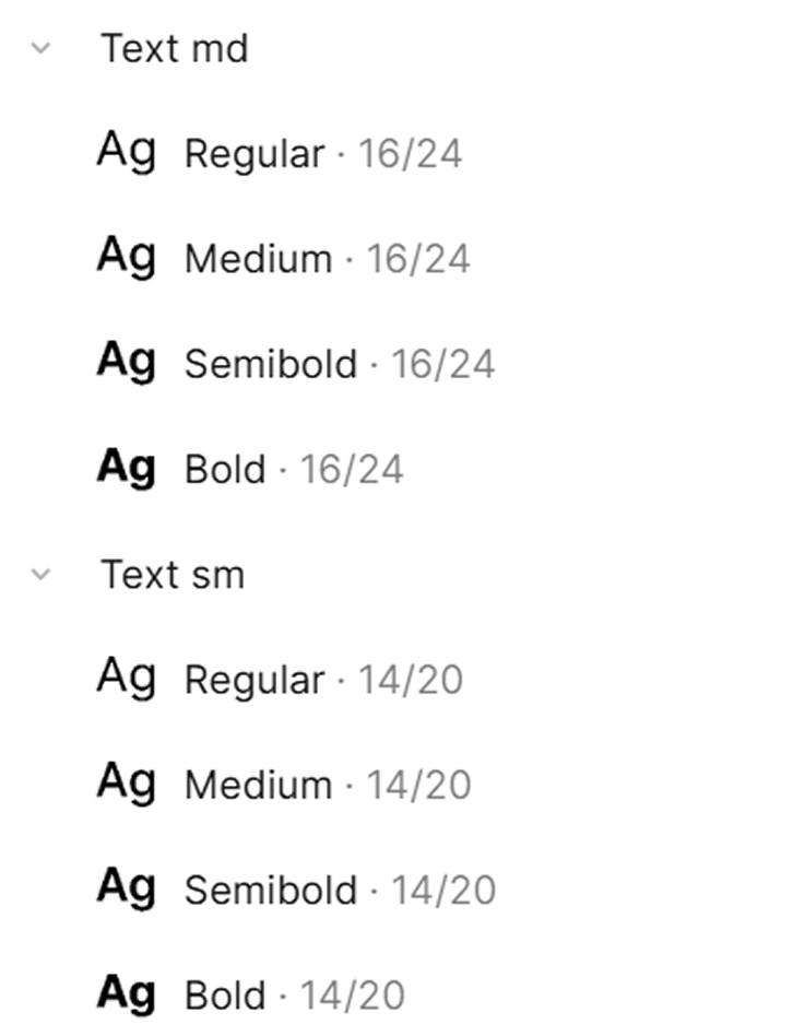
We started with foundations because everything rests on them. Typography moved to Inter with variable weights and tabular numbers so prices and timers align cleanly.
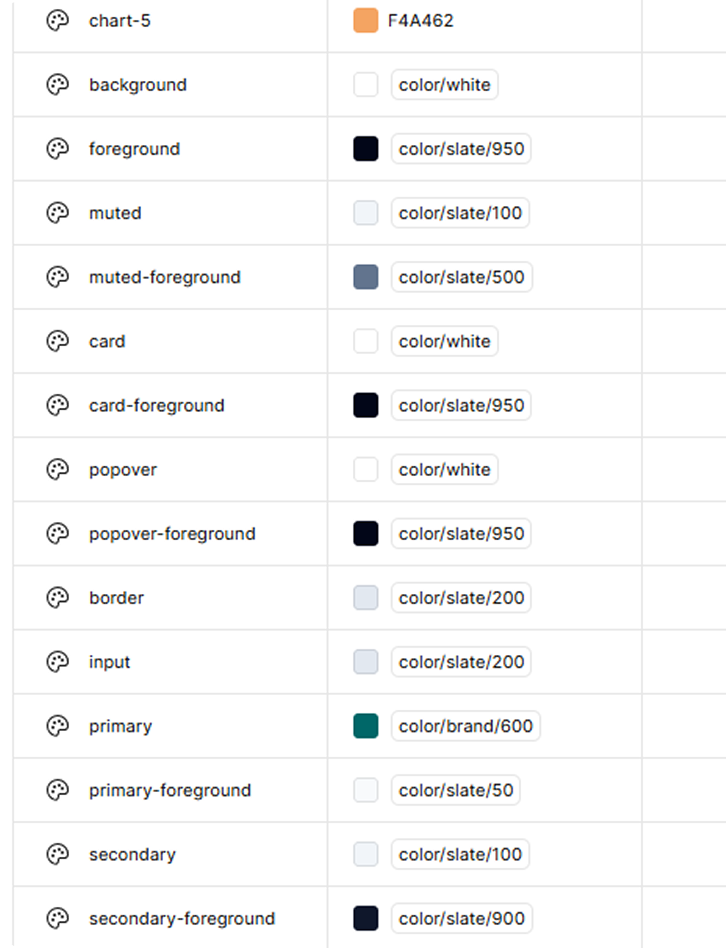
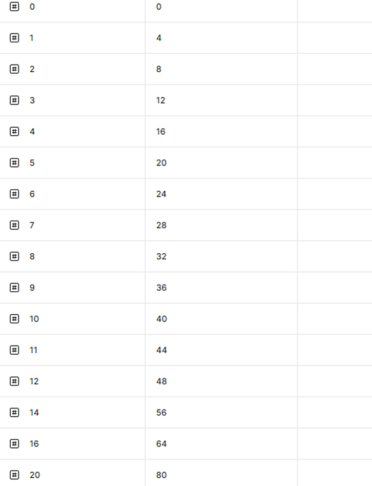
Colors combined brand tones with semantic roles and met contrast targets. Spacing followed a four point scale that keeps rhythm simple. Elevation levels matched common mobile platforms to make depth feel familiar.
These tokens became a single language for design and code and they made later theming and accessibility work straightforward.
Typography
Adopted Inter with variable weights and tabular numbers for prices and timers.
Color
Established brand colors and semantic palettes with proper contrast.
Spacing
Set up a 4-point grid for rhythm and clarity.
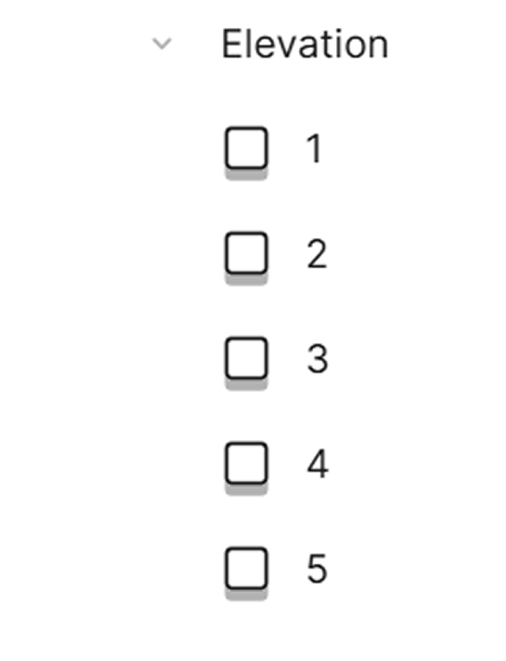
Elevation
Aligned shadow levels with iOS and Android standards.
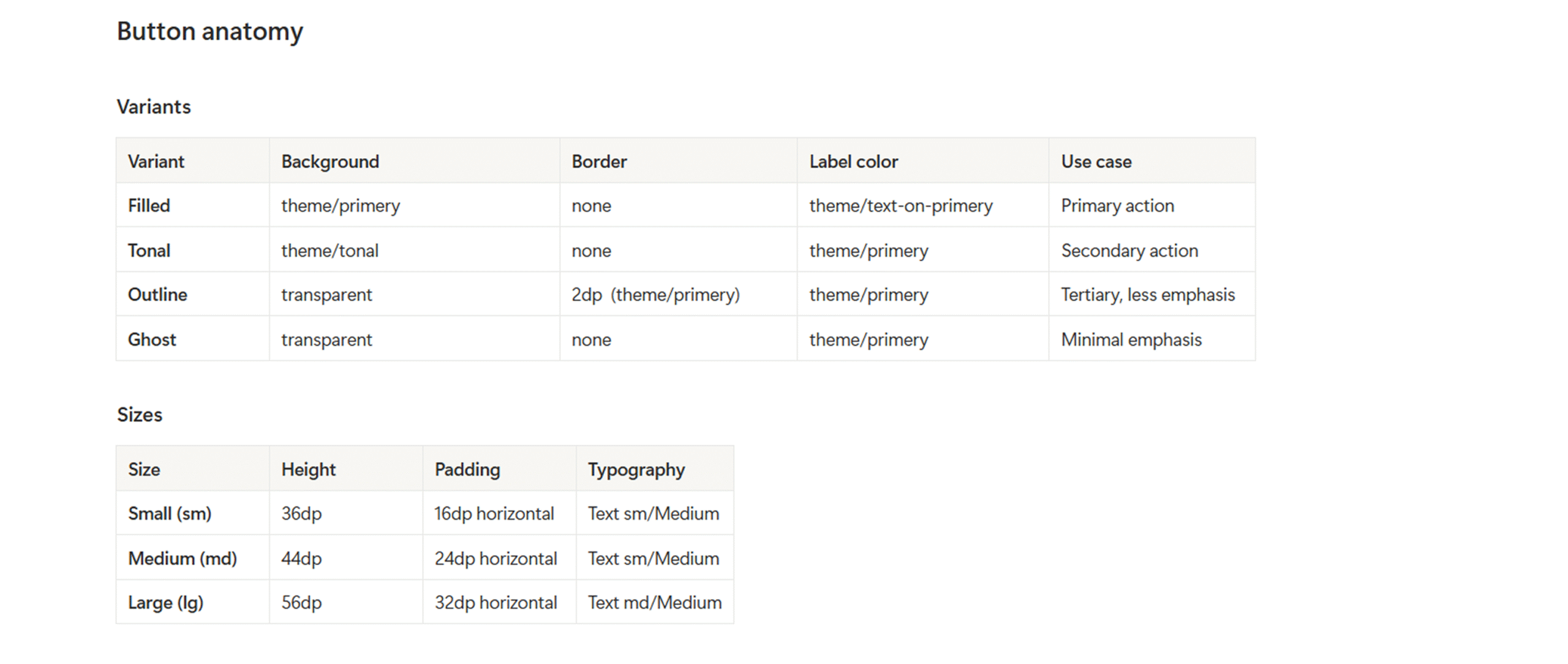
Components
Choosing What to Build First
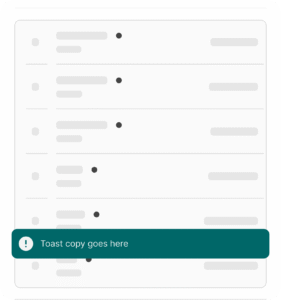
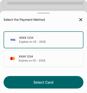
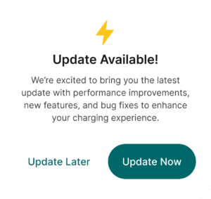
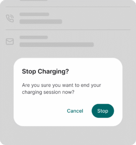
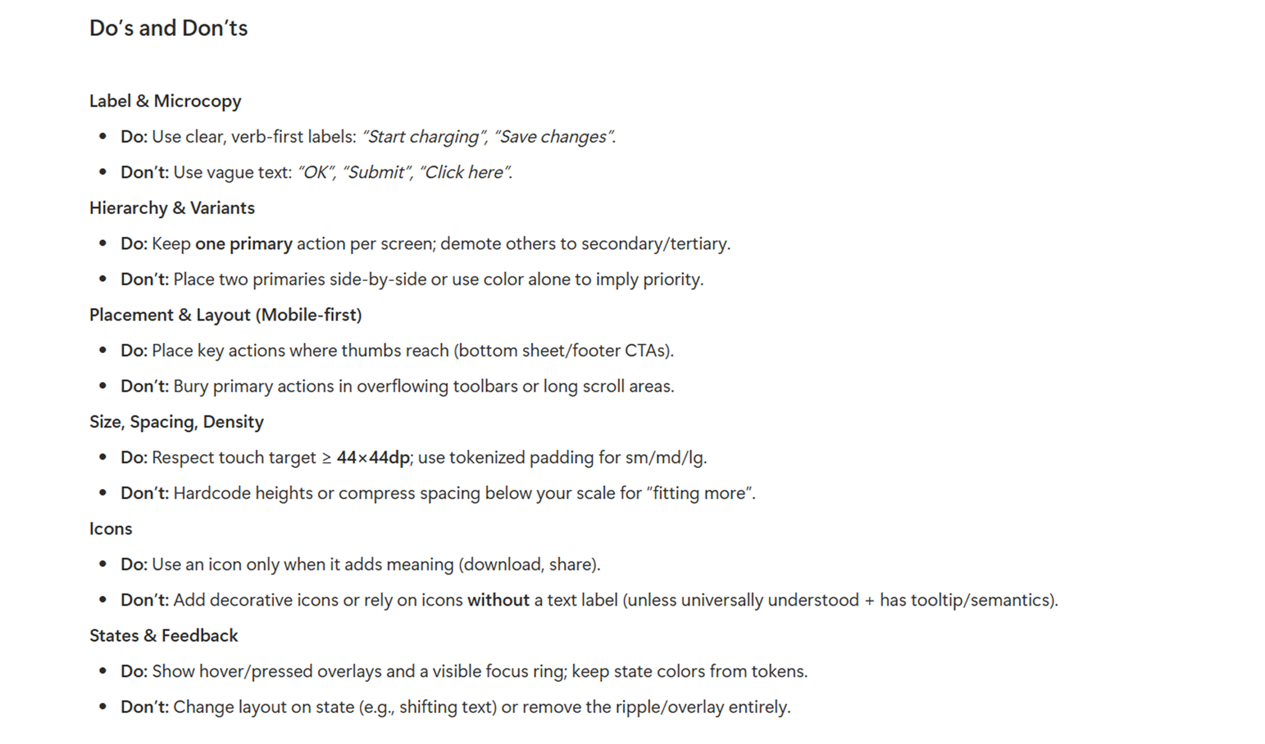
We chose components that appear on nearly every screen and are feasible in Flutter within our window. Buttons came first, then dialog, toast, bottom sheet, input fields, and the navigation header.
For each we defined anatomy, variants, sizes, and states. We mapped every visual to a token. We wrote simple rules for when to use each piece so teams could assemble flows quickly without debate.
Documentation
Writing Docs People Actually Read
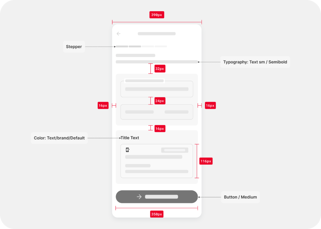
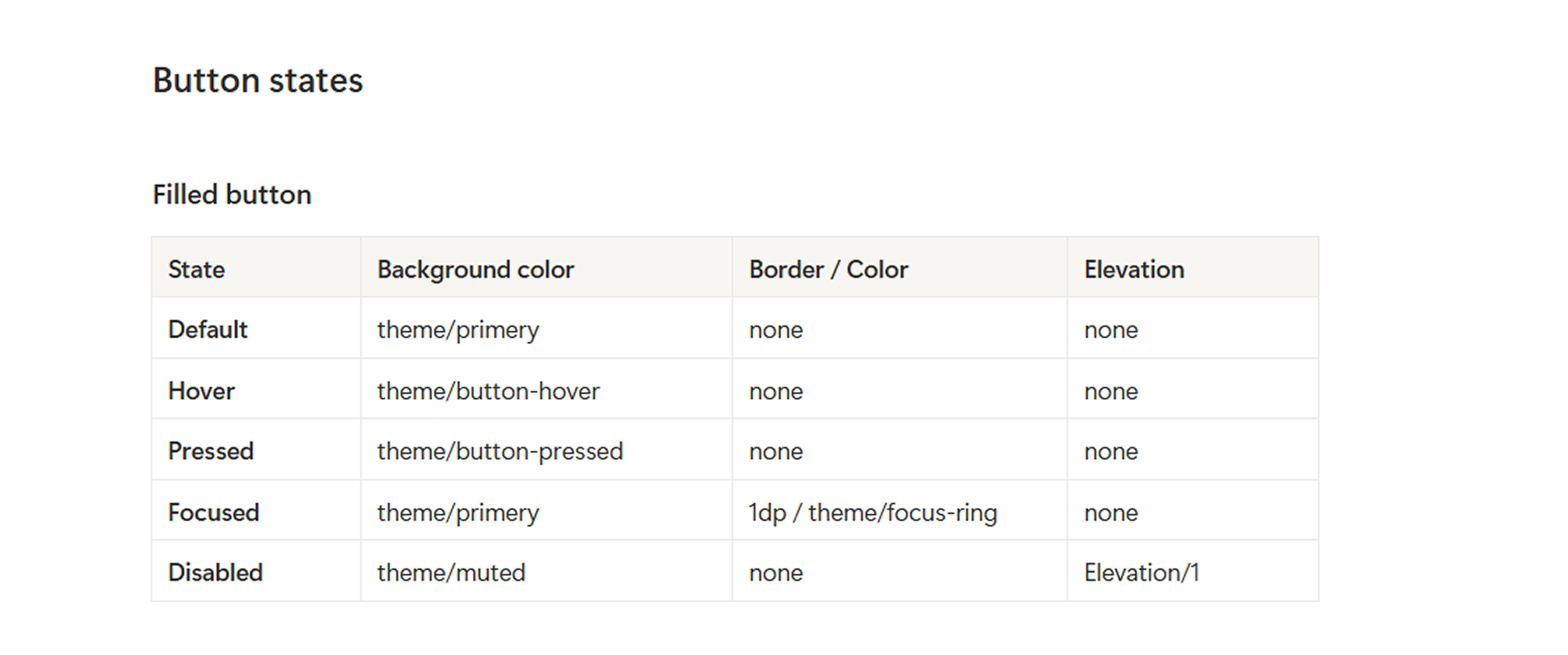
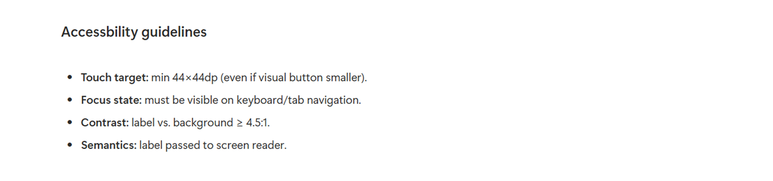
Documentation had to lower friction, not add more work. Every component page opened with what it is for and when to use it. We showed anatomy with clear labels, listed sizes and spacing, and pictured states from default to loading to error.
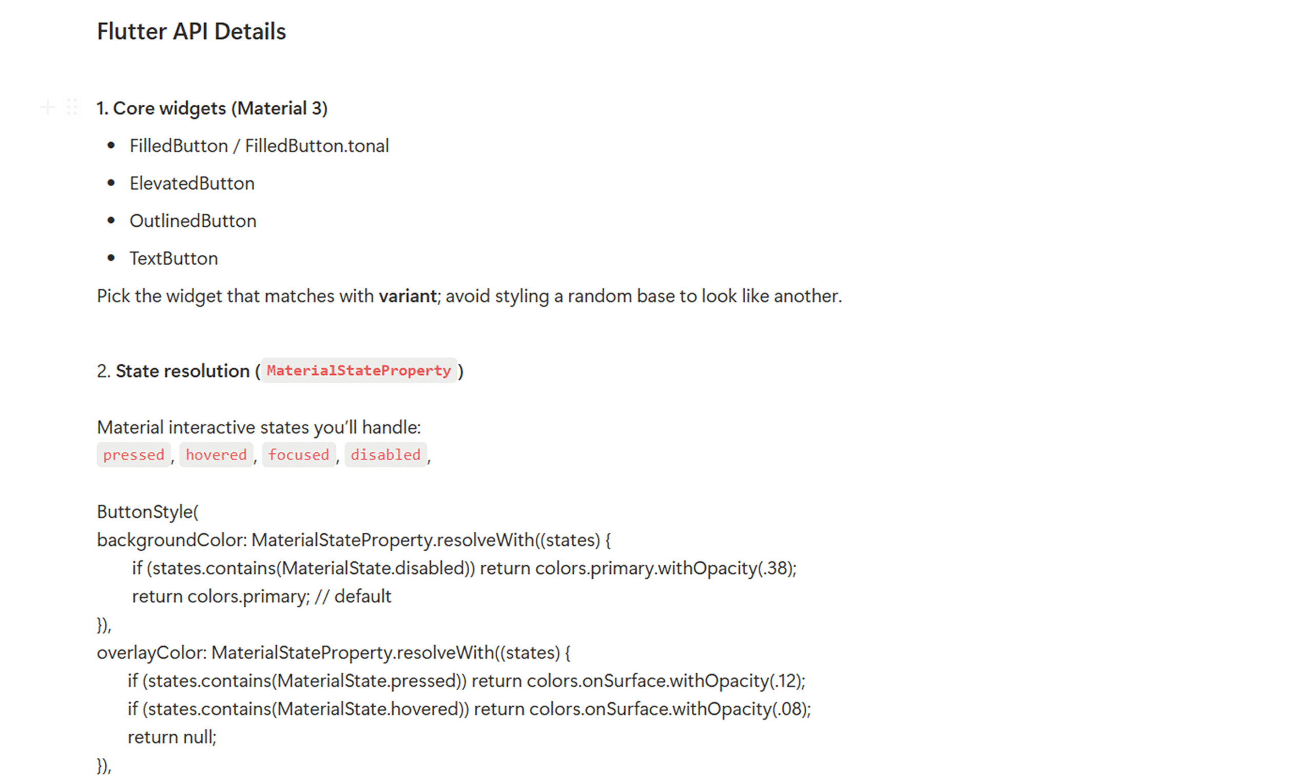
Accessibility guidance sat next to the visuals so it could not be missed. A token map named the exact variables. A short API section showed the props and sensible defaults with a tiny code example.
Anatomy and specs (sizes, spacing, typography, icons).
States and behaviors (disabled, loading, validation).
We built a fast loop that turned ideas into verified components. Designers prepared the spec and tokens. The developer implemented and exposed variants and sizes.
We reviewed behavior in a component catalog where we could toggle states, themes, and right to left layouts. Golden tests captured visual baselines so regressions could be spotted in seconds. Small fixes moved quickly and each pass raised confidence that the component would behave the same across the app.
Deliverables
Shipping a Solid First Version
At the end of the window we delivered a compact but complete set. Seven modular components with consistent variants and sizes. A token library covering typography, color, spacing, and elevation.
A design kit that mirrored the code so handoff felt effortless. Practical documentation that teams could trust during daily work. Everything aligned to the same names and the same rules so changes were safe and adoption felt natural across new features.
07 modular, tokenized Flutter components.
Full design tokens for typography, color, spacing, and elevation.
Documentation with anatomy, usage, and API details.
A Figma UI Kit perfectly aligned with code.
Impact
Seeing the Difference in Real Work
The effect showed up in daily routines. Screens assembled faster because teams pulled from known parts instead of guessing. Visuals and behavior matched across flows which reduced design QA time and reopened focus for product ideas.
Accessibility improved by default through consistent contrast, focus treatment, and touch targets. Developers reported higher confidence because the catalog and tests made quality visible.
Screens assembled from reusable components instead of one-off builds
Screen build time reduced by ~25–35% across key flows
Using BoostUI feels straightforward. I grab a component, set a couple of props, and it just works the way the designs show.
Nisal Silva
Tech Lead
The consistency is a relief. Once we aligned on tokens, every screen started looking and behaving the same without extra tweaks.
Rajitha Srimal
Senior Software Engineer
The docs and examples save time. I can see the anatomy, states, and code snippet in one place and ship faster.